Dark and Moody Coffee Table Decor Ideas for a Sophisticated Living Room
Most of the coffee table advice I’ve written leans light: linen, pale wood, airy neutrals. That’s not because it’s the only way to do this well, it’s just the direction most small apartments naturally pull toward. But every so often I style a table in deep, moody tones instead, and I forget every time how much more dramatic a room feels with a coffee table that leans dark instead of light. If your living room already has that sophisticated, low-lit, slightly dramatic feeling to it, a pale styled table can actually work against the room instead of with it. This is the version built for that room.
Why a Dark Palette Reads as Sophisticated, Not Heavy
There’s a common worry with dark decor: that it’ll make a room feel smaller or heavier than it already is. Done right, a dark coffee table doesn’t shrink a room, it grounds it. The trick is contrast and restraint. A dark table styled with too many objects reads as cluttered and heavy. A dark table styled with just a few, well-chosen pieces reads as intentional and refined, the same tall, medium, low principle from a balanced coffee table, just executed in a deeper color story.
Start With the Base: Dark Wood or Stone
An espresso-toned wood table, a dark stone top, or even a black metal-framed table all work as the foundation here. If your existing table is a lighter wood, you don’t necessarily need to replace it, a dark tray placed on top can do a surprising amount of the visual work, anchoring the styling in a darker tone even if the table itself is lighter underneath.
If you’re starting from scratch and choosing a table specifically for this look, stone or a stone-look surface (marble with dark veining, or a poured concrete top) reads even more dramatic than wood, because it picks up light differently. Wood absorbs light and stays matte-looking under most conditions. Stone reflects it, so the same dark palette gets a bit of shimmer and movement instead of sitting completely flat. Neither is wrong, it’s a matter of how much drama you want the table itself to carry versus how much you want the styling on top to do the work.
The Core Pieces
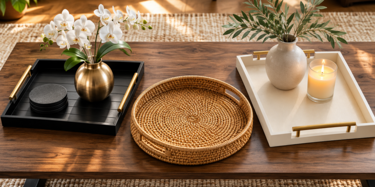
- A matte black or dark bronze tray, rectangular reads slightly more modern, round reads slightly softer
- A near-black or deep charcoal ceramic vase, the matte finish matters more here than the shape, glossy black can read cheap in a way matte never does
- Dried botanicals instead of fresh greenery, they hold the dark, dramatic mood better than bright green stems would
- A charcoal or deep espresso pillar candle, unlit during the day, it still reads as an intentional color choice
Beyond those four staples, a few optional additions work well if you want to build the grouping out slightly: a small stack of dark-cover coffee table books (art or architecture titles tend to have the darkest, most uniform spines), a single piece of dark stone or marble, like a small bowl or coaster set, or a textured object in a matching tone, a woven charcoal basket, a dark ceramic dish with an irregular glaze. The goal with any addition is the same: it should deepen the palette, not lighten it or introduce a competing color.
Don’t Forget a Metallic Accent
The one mistake I see most with dark palettes is leaving them too flat. All-black, all-matte, no metal anywhere, and the whole grouping can start to look more like a shadow than a styled table. A single warm metallic accent, brass, aged gold, or bronze, fixes this instantly. It can be as small as the rim of the tray, a thin gold band on the candle holder, or a brass detail on the vase. You don’t need much. One warm metallic touch against all that dark matte is what separates “moody and elevated” from “just dark.”
What This Looks Like in Practice
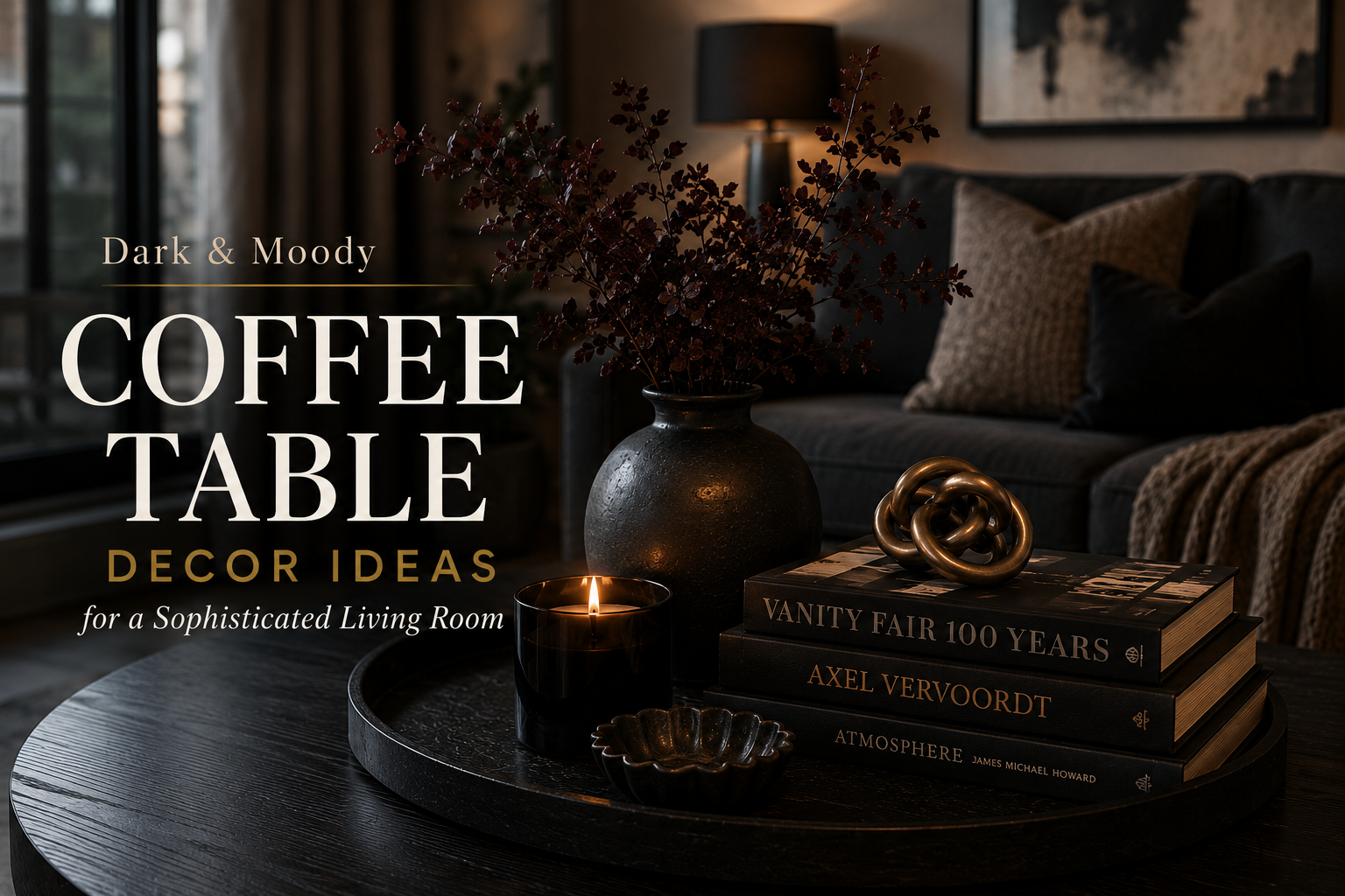
A dark espresso coffee table with one matte black tray anchoring the center. On it: a near-black ceramic vase with a few dried botanical stems, one charcoal pillar candle, and a single dark-cover coffee table book lying flat beside the tray. Four objects total, generous space between them, moody low-angle light from one side. Nothing else on the table. That restraint is what keeps a dark palette from tipping into heavy or cluttered.
Keep the Object Count Lower Than You Would With a Lighter Palette
This is the one real rule that changes with a dark palette: use fewer objects than you would with a light, neutral setup. Where a light table can comfortably hold five objects and still feel airy, a dark table starts to feel visually heavy past three or four. Dark colors carry more visual weight per object, so the same odd-number, tall-medium-low formula applies, just with fewer total pieces.
Lighting Matters More Here Than With Any Other Palette
A dark-styled table depends more on lighting than a light one does. In bright, even daylight, dark objects can read as flat, almost like silhouettes instead of dimensional pieces. This look was built for warmer, lower, more directional light, a table lamp nearby, late afternoon window light, or evening lighting. If your living room is very bright and evenly lit all day, this palette may not fully deliver on its own, that’s not a flaw in the styling, just a mismatch with the room.
If you do have a very bright room but still want this look, a table lamp placed close to the table, even during the day, can create enough directional shadow and warmth to make the dark tones read properly. It doesn’t need to be dramatic, one warm-bulb lamp nearby, positioned so the light rakes across the table rather than flooding it from above, is usually enough.
What This Looks Like in a Small Apartment vs. a Large Living Room
In a smaller apartment living room, this palette works best when it’s the one dramatic note in an otherwise simpler space, a dark coffee table against lighter walls and furniture, rather than a fully dark room. That contrast is actually what makes it read as intentional instead of overwhelming in a small footprint. Keep the object count on the lower end here, three pieces, and let the table itself carry most of the visual weight.
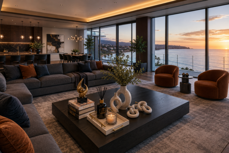
In a larger living room, you have more room to let the dark palette extend beyond just the table, a dark-framed piece of art nearby, a black or bronze floor lamp, deeper-toned throw pillows on a neighboring sofa. The coffee table doesn’t have to be the only dark note in the room, it can be one part of a broader moody color story. If you’re going this route, keep the styling on the table itself simple regardless of the room’s size, the temptation in a larger space is to add more objects to “fill” the table, but the tall-medium-low restraint still applies no matter how much surface you’re working with.
A Few Common Mistakes With This Palette
Going too matched. An all-black tray, all-black vase, all-black candle holder in the exact same finish can read more like a matching decor set than a styled table. Vary the material, matte ceramic, dark wood, aged metal, even within the same dark color family.
Skipping the metallic accent. Covered above, but worth repeating because it’s the single most common miss: an all-matte, all-dark grouping with nothing warm in it tends to disappear into the room rather than stand out from it.
Using fresh flowers instead of dried. Bright green stems or pale flowers against a dark palette create a jarring contrast that undercuts the whole mood. Dried botanicals, in rust, tan, or deep brown tones, hold the palette together in a way fresh greenery can’t.
Overcrowding because “dark needs more to fill the space.” It’s the opposite. Dark, matte surfaces already carry a lot of visual weight on their own. Adding more objects to compensate for a table feeling “empty” usually just makes it feel cluttered instead.
Who This Look Is For
This isn’t for every living room, and that’s fine. It’s a strong fit if your space already leans toward deep, saturated colors, moodier lighting, or a more formal, evening-oriented feel. If your room is bright, casual, and full of natural light all day, a lighter palette will likely feel more at home, and that’s a completely valid choice too. Styling should match the room you actually have, not a look you saw somewhere else.
Putting It Together
A dark wood or stone base. A matte black tray. One near-black vase with dried botanicals. A charcoal candle. Fewer objects than you’d use in a lighter palette, and warmer, lower light to let the dark tones actually read. That’s the whole approach, and it turns a coffee table into one of the most dramatic, intentional-feeling pieces in a moody living room.
For more coffee table styling ideas, read our guides on how to make a coffee table look refined and expensive, the simple formula for a perfectly balanced coffee table, and five coffee table styling mistakes to avoid, and warm neutral coffee table decor ideas.