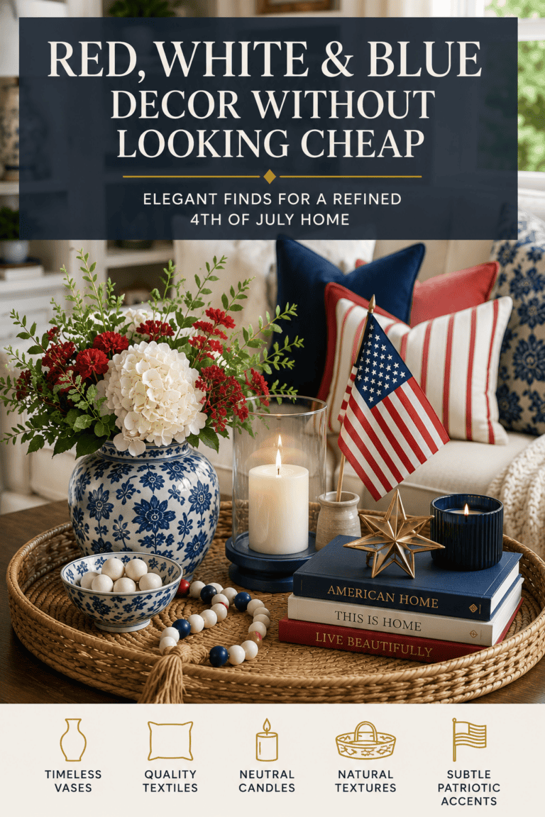
Red, white, and blue carry a lot of weight as colors. They mean something. And because they mean something, a lot of people avoid them in their homes entirely, afraid the room will tip from refined to costume, from intention to cliche. I understand that hesitation. I have felt it. But I also know that the answer is not avoidance. The answer is knowing how to use them well. That is exactly what this post is about.
Esta publicación contiene enlaces de afiliados. Si compras a través de estos enlaces, puedo ganar una pequeña comisión sin costo adicional para ti. Gracias por apoyar a Harvest Edge Living.
There is something genuinely lovely about dressing your home for the 4th of July, the season is warm, the days are long, and there is a kind of joy in marking the moment. The only question is how to bring that feeling in without it taking over the room you have spent so much time making your own.
La buena noticia es que el rojo, el blanco y el azul son colores hermosos. Cuando se usan con la misma intención que aplicas a todo lo demás en tu hogar, pueden hacer que una sala de estar se sienta festiva y refinada al mismo tiempo. Esta guía te mostrará exactamente cómo hacerlo.
Start with navy, it feels like home
Navy is where this palette begins, and once you start working with it, you will wonder why you ever hesitated. It is one of those colors that makes a room feel instantly grounded and complete, the same way a deep green or a warm charcoal does. Rich, calm, and timeless.
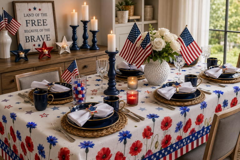
A navy ceramic vase on your coffee table, a navy linen throw folded over the arm of your sofa, or a pair of navy taper candles on a side table, any of these will anchor the whole look beautifully. And the best part? Navy is so at home in a well-styled living room that you will likely want to keep it long after the holiday is over.
Empieza con una pieza en azul marino y que marque la pauta para todo lo demás.
Un poco de rojo da mucho juego
Red is the heart of this palette, warm and full of life. It just works best when it is used with a light touch. One well-chosen red piece can bring an entire vignette to life. Several red pieces competing for attention will tip the balance from lovely to loud.
Una sola vela junto a tu bandeja es todo lo que necesitas. Quizás un pequeño objeto de cerámica roja colocado en una estantería, o un tallo floral rojo en medio de un arreglo de otro modo neutral. Estos pequeños momentos de color se sienten intencionales y hermosos en lugar de excesivos.
Confía en la moderación. Funciona cada vez.
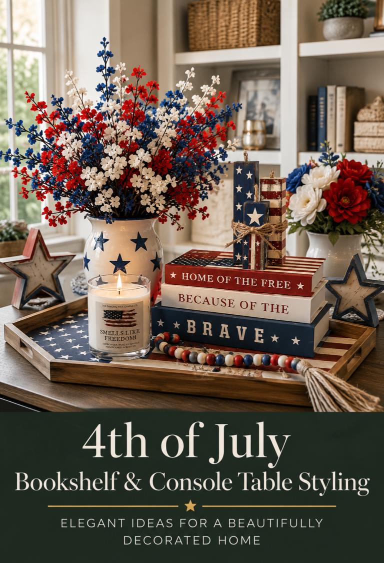
Recomendado: La Vela que Baila Huele a Libertad
White and cream, the quiet magic
Here is a secret about this color palette: the white and cream elements are doing more work than anything else. They are what keeps the red and navy from competing with each other. They create breathing room, softness, and calm, and the best part is that you probably already have them throughout your home.
Cream-colored walls, light-toned books, a natural linen tray, dried white florals in a vase, these are the things that tie the whole look together without you needing to add a single new piece. They are already part of your room. The 4th of July palette simply invites you to see them in a new light.
Si quieres incorporar algo fresco, tallos florales patrióticos en rojo, blanco y azul son un añadido hermoso y festivo sin verse exagerado.
Recomendado: Patriotic Silk Flowers, Red, White & Blue · Palitos decorativos patrióticos con estrellas
Una viñeta de mesa de café que te encantará
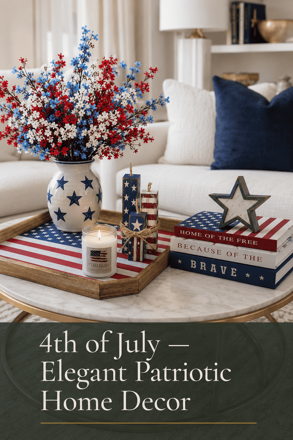
The coffee table is the perfect place to bring this whole palette together, a small, contained space where you can play with color without committing to anything room-wide. This arrangement comes together in about ten minutes and looks genuinely beautiful:
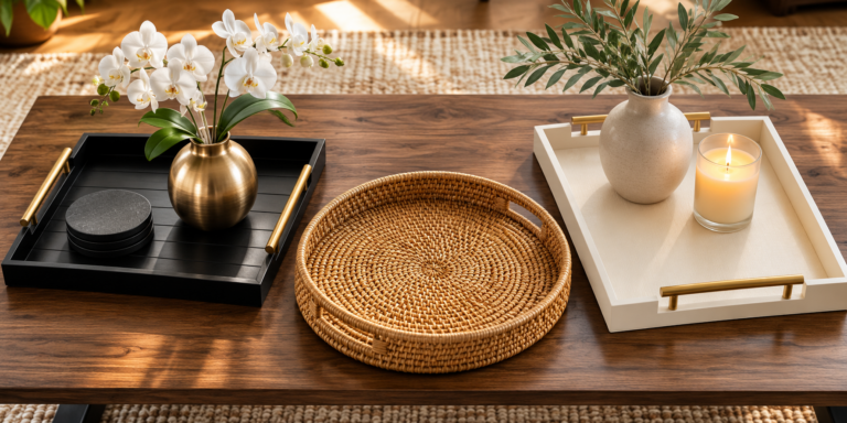
- Una bandeja patriótica como base
- Tallos florales patrióticos en un jarrón
- Una vela colocada al lado de la bandeja
- Un conjunto de libros decorativos festivos apilados debajo o al lado
Eso es realmente todo lo que se necesita. Cuatro piezas, tres colores, una bandeja para mantenerlo todo unido. Deja que los tallos florales sean el elemento más alto, que la vela esté a media altura y que los libros queden abajo. Esa superposición de alturas es lo que hace que todo se vea compuesto e intencional en lugar de simplemente colocado.
Recomendado: Bandeja de servicio con bandera americana patriótica MyGift · Libros decorativos del 4 de Julio
Fácil de armar, fácil de desarmar
One of the most satisfying things about styling this way is how effortlessly it transitions. Because nothing structural has changed (no new curtains, no furniture rearranged, no large commitments) taking down the seasonal styling is as simple as removing the candle, putting away the tray, and returning the room to where it was.
Esa facilidad de transición es precisamente lo que hace que la decoración estacional sea agradable en lugar de una tarea pesada. Obtienes toda la calidez de marcar el momento y tu hogar está listo para pasar al resto del verano sin perder el ritmo.
Tres cosas a recordar
Vuelve a estos siempre que necesites un empujoncito en la dirección correcta:
- Empezar con azul marino, it brings depth and calm to the whole palette
- Usa el rojo con moderación, one beautiful accent is more powerful than five
- Confía en tus blancos y cremas, they are already doing the work
Your living room can feel festive and beautiful and completely like you, all at the same time. That is the whole idea.
¿Buscas las piezas específicas para lograr este look? Explora la colección seleccionada en la Compra el look página.
Esta publicación contiene enlaces de afiliados. Si compras a través de estos enlaces, puedo ganar una pequeña comisión sin costo adicional para ti. Gracias por apoyar a Harvest Edge Living.