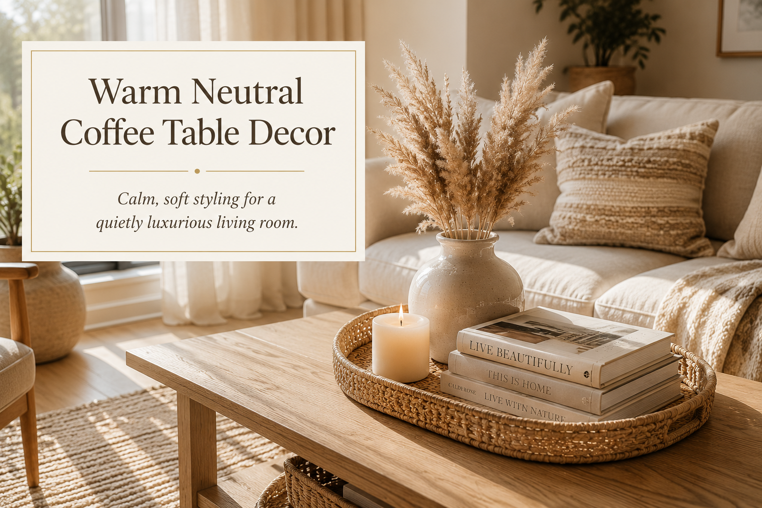
Warm Neutral Coffee Table Decor Ideas for a Calm, Refined Living Room
I wrote about dark, moody coffee table styling not long ago, and almost immediately started missing the opposite version. There’s something about a warm neutral table, cream, natural wood, soft ivory tones, that feels less like a statement and more like an exhale. If a dark palette is the version of your living room dressed up for evening, this is the version that’s just comfortable being itself all day. Neither one is more “right.” They’re just doing different emotional work in a room.
Why Warm Neutral Reads as Calm, Not Boring
The risk with an all-neutral palette is that it can slide into feeling flat or forgettable if every piece is the exact same shade of beige. The fix isn’t more color, it’s more texture and material variation within the neutral family. Natural wood grain, raw linen weave, a slightly imperfect ceramic glaze, these all read as calm and intentional rather than boring, because your eye still has something to notice even without strong color contrast.
Start With the Base: Light Wood or Warm Stone
A light oak or ash-toned wood table is the classic foundation here, but a warm travertine or limestone top works just as well if you want something with a little more visual texture. Both read as soft and warm rather than stark, which is the key difference between this look and a cooler, more minimalist white-and-gray palette. If your existing table is a darker wood, you don’t have to replace it, a light natural-wood tray placed on top can shift the whole vignette toward this warmer feeling even with a darker surface underneath.
The Core Pieces
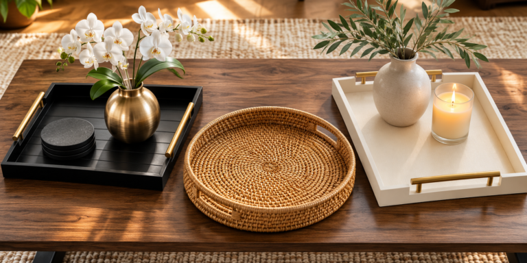
- A natural wood or woven rattan tray, unfinished or lightly stained wood reads warmer than anything painted or lacquered
- A cream or ivory ceramic vase, a slightly uneven, handmade-looking glaze adds more texture than a perfectly smooth one
- Dried pampas grass or neutral-toned dried stems, they read soft and warm without introducing any strong color
- An ivory or unbleached beeswax pillar candle, the slightly off-white tone matters more here than in a stark white palette
Beyond those four staples, a few pieces work especially well to round out the grouping: a small stack of light-cover coffee table books (linen-bound or cream dust jackets read best), a woven or rattan coaster set, or a small stone or alabaster dish. As with any palette, the goal with additions is consistency, everything should stay within the warm, soft, low-contrast family rather than introducing a bright white or a cooler gray tone that will read as slightly off.
Layer in Texture, Not Color
Since this palette avoids strong color contrast almost entirely, texture has to do the work that color would normally do. A smooth ceramic vase next to a woven rattan tray next to a raw linen book cover, three different textures within the same narrow color range, is what keeps this look from feeling flat. If everything on the table has the same smooth, matte finish, even in a beautiful neutral tone, the whole grouping can start to feel a little lifeless. Mix at least two or three distinct textures every time.
What This Looks Like in Practice
A light oak coffee table with one natural wood tray anchoring the center. On it: a cream ceramic vase with a few stems of dried pampas grass, one ivory pillar candle, and a single light-cover book lying flat beside the tray. Four objects total, soft warm daylight from the side, generous space between each piece. Nothing competing, nothing glossy, nothing stark white. That gentle texture variation across wood, ceramic, and paper is what carries the whole look.
Keep the Lighting Warm, Not Bright and Flat
This palette can actually handle more daylight than a dark one, that’s part of why it works so well in bright, sunny living rooms. But the light still needs to read as warm rather than cool or clinical. Late morning or afternoon sunlight, or a warm-temperature bulb nearby in the evening, keeps the cream and ivory tones feeling soft. Under a very cool, blue-toned light, the same palette can start to look sterile instead of calm, so if your room runs on cooler overhead lighting, a warm-toned lamp nearby is worth adding.
What This Looks Like in a Small Apartment vs. a Large Living Room
In a smaller space, this palette is one of the easiest to get right, because a light, warm-neutral table doesn’t visually shrink the room the way a dark one can. Keep it to three simple pieces, tray, vase, candle, and let the natural light in the room do most of the work. This is also the palette that photographs most forgivingly in a small space with limited natural light, since it doesn’t rely on shadow and drama the way the dark version does.
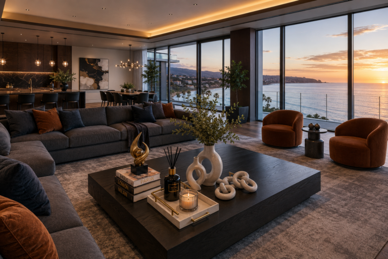
In a larger living room, you can extend the warm neutral story beyond the table, a jute or wool rug, linen throw pillows, a light wood console nearby. The coffee table becomes one part of a broader warm, soft color story rather than the only neutral note in the room. Even at a larger scale, though, keep the object count on the table itself restrained, three to five pieces, so the texture variation stays legible instead of turning into visual noise.
A Few Common Mistakes With This Palette
Making everything the exact same shade. If the tray, vase, and candle are all identical off-white, the grouping loses definition. Vary the undertone slightly, warmer cream against cooler ivory against natural wood, so there’s still some visual distinction between pieces.
Skipping texture entirely. An all-smooth, all-matte, all-one-material table in this palette is the fastest way to make it read as boring instead of calm. At least one woven, raw, or textured element keeps it interesting.
Using anything glossy or stark white. A bright white glossy vase against warm cream and natural wood creates the same jarring contrast that fresh green flowers create against a dark palette. Everything should stay in the same warm, matte family.
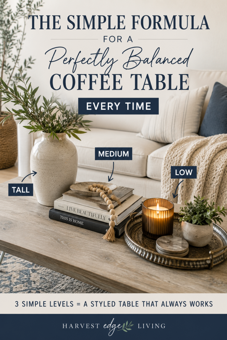
Treating “neutral” as an excuse to skip styling altogether. A neutral palette still needs the same tall, medium, low structure and restraint as any other. It’s a color choice, not a shortcut around the actual styling formula.
Who This Look Is For
This palette is a strong fit for almost any living room that gets good natural light and leans toward a soft, comfortable, everyday feeling rather than a dramatic one. It’s especially forgiving in small apartments and rentals, since it works with existing light wood furniture rather than requiring a full dark-toned redo. If your room already leans cool and modern, gray tones, black metal, glass, this warm neutral palette may feel slightly out of place next to it, in that case the dark and moody version, or a cooler all-white palette, will likely feel more at home.
Putting It Together
A light wood or warm stone base. A natural wood or rattan tray. A cream ceramic vase with dried pampas grass. An ivory candle. Texture variation instead of color contrast to keep it from feeling flat, and warm, soft light to let the tones read properly. That’s the whole approach, and it turns a coffee table into one of the calmest, most lived-in feeling pieces in a warm, soft living room.
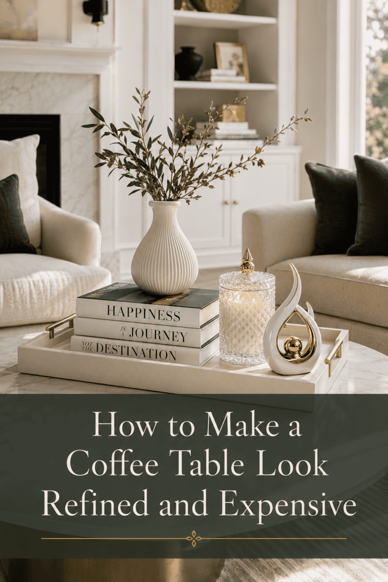
For more coffee table styling ideas, read our guides on how to make a coffee table look refined and expensive, the simple formula for a perfectly balanced coffee table, and dark and moody coffee table decor ideas, the counterpart to this one.